
How we created Ana Paula Almeida's identity

Text: Miguel Barbot and Maria Helena
Ana Paula Almeida, artist and maker, among many other things, came to us with a challenge. To think strategically about the brand, she was creating for a product and, based on that thought, to develop the entire visual identity.
The product in question is a lamp whose most distinctive feature (in addition to the design) is that it is built with wool yarn. These yarns are the leftover stock from the wool factory that now houses the New Hand Lab, a life project by Ana.
An initial consultancy work took us on a journey through the different possibilities for creating a new brand. Still, all the paths took us to uninteresting territories since there was something more than that, almost like a latent thought we wanted to translate into something concrete.
One day there was light (almost literally, which is what lamps do). But we couldn't find a way because what we were looking for was not a brand with all its limits. It was a hat for all the design work, the artistic creation and all the client's ramblings and explorations. But, the brand was already there and is the very name of the designer, artist and explorer of ideas Ana Paula Almeida (APA). This name/brand assumes greater importance because of what it does professionally in a different area. For instance, she is a chemistry teacher, and APA uses another name in that profession: Ana Paula Costa (APC, like Jean Touitou's famous brand).
Having resolved the issue of the brand, we set out for one of the works strongly marked by the creative direction. We made mood boards after mood boards, exchanged ideas and analysed what it is to communicate a design brand visually. We also looked at what others have done and saw that everyone had done it the same way. Then we looked for points of interest in each one of them (sadly homogeneous) and then at other places, such as fashion, craft and the visual arts in general.
After marking a path and an aesthetic, it was important to isolate some elements: the APA and the New Hand Lab are in Covilhã, an industrial wreckage city in the middle of the Serra, with a new post-industrial life and an economy almost reborn, fueled by the University and by public and private investments.
The dialogue between the old concrete and fresh paint piqued our interest. The interaction created between the factory and its brambles and the mountain, between the rough and the refined.
We started by exploring two paths in art direction. One with a solid typographic predominance, where we looked for elements that were out of tune or out of place. The other with a more free and oriental expression. In the convergence of these two paths, we found the right direction.
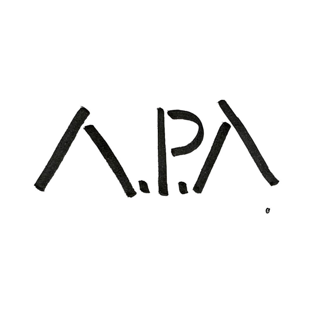
The typographic choice fell on Signo from Rui Abreu (R-Typography). We used the weight "light" for the logo. We removed the AA crossbar to bring it closer to the more oriental designs we explored in the symbol. By this time, we were still unwilling to drop (and it didn't fall, it just transfigured).
With the countless possibilities of application, each one with its challenges, we decided not to make a "logo" but rather a flexible visual system that comprises different variations of the same name/brand: APA, A. P. Almeida, Ana P. Almeida, Ana Paula Almeida, which, depending on the context and support, is complemented by the symbol, now also adapted to the chosen typography (even the outer rim has the same expression).


The coherence of the visual system also lives through non-typographic elements: illustration (between the built and the natural), photography (always monotone), and the colour palette (chosen among the colours of the threads).
The environment deeply informed the illustrations of the territory and places where the brand lives daily. They evoke the industrial environment in the multiple transpositions of gestures and materials that naturally occur in the workshops, where we think of the tables and floor marked by the various movements and work processes. They parallel the texture of the concrete and the brutalist architecture that populates the landscape, contrasted by the pale colours of the palette. The illustration creates a scenario where we explore more subtle memories and feelings, difficult to communicate otherwise.
For the colour, we got inspiration from the multiple threads Ana uses in her pieces and the vegetation that dots the region's mountains.
The visual system allows you to add illustrations, respecting the path and direction already established but being flexible enough to grow with the brand.
Mastering the system allows us to find consistency between the different supports and functions: catalogues, synthetic, packaging, and stationery. It also allows the development of new visual elements in a very organic and free way, a role that illustration as a discipline plays to perfection.
Credits:
Creative Direction: Miguel Barbot, Maria Helena
Art Direction: Maria Helena
Graphic Design: Maria Helena, Mariana Teixeira
Illustration: Maria Helena
Typography: Signo - R Typography