
How (and why) we made the new Ofício website

Text: Miguel Barbot
The project took several weeks, and, like all internal projects, creating a new website for Ofício was constantly pressured by the tight schedule of other things.
The need arose in 2021 when we launched the new Ofício identity. The site, which had evolved disorganizedly over the years, was no longer fulfilling its function, not even remotely. It didn't even respect the direction that Miguel Moreira had given our identity.
In the meantime, many things happened: we moved house to our other half's side, Saber Fazer, and the team grew (Maria Helena, who until then had collaborated as a freelancer, joined the permanent team, and Mariana joined shortly after). We also refined our positioning as a consulting practice and creative studio.
We ended up moving away (just) a little from the more classical Craft notion at our origin. Instead, we took shelter under a wider hat, which better reflects the type of clients we have worked with: businesses and independent projects, with a solid creative and value creation component, whether in Craft, design, art or gastronomy and hospitality.
Therefore, the new website would have to reflect a new phase: a bigger studio, a focus on consultancy and design and better navigation in projects and portfolio representation. We simplified this task by dropping the retail business (store dedicated to Craft), agency and intermediation. These are important and relevant but don't align with the current structure and concerns.
The site is now simpler, with a Portuguese version and an independent English version (instead of the bilingual pages we had), fewer sections, but better content in each of them: a home page with the presentation of services, team and partners; a page with a browser in our projects and portfolio; a journal, or blog, which is where you are reading this and where you can learn more about our case studies and what we are working at the moment.
At the same time, we decided to start a more active communication process, integrating Ofício into our studio workflow as if it were a client: regular programming for social networks, more content in the journal and, finally, a newsletter as it should be, which it's called "Ossos do Ofício", (Ofício's Bones) a simple tribute to our human resources quadruped, which you can subscribe to below, in the footer.
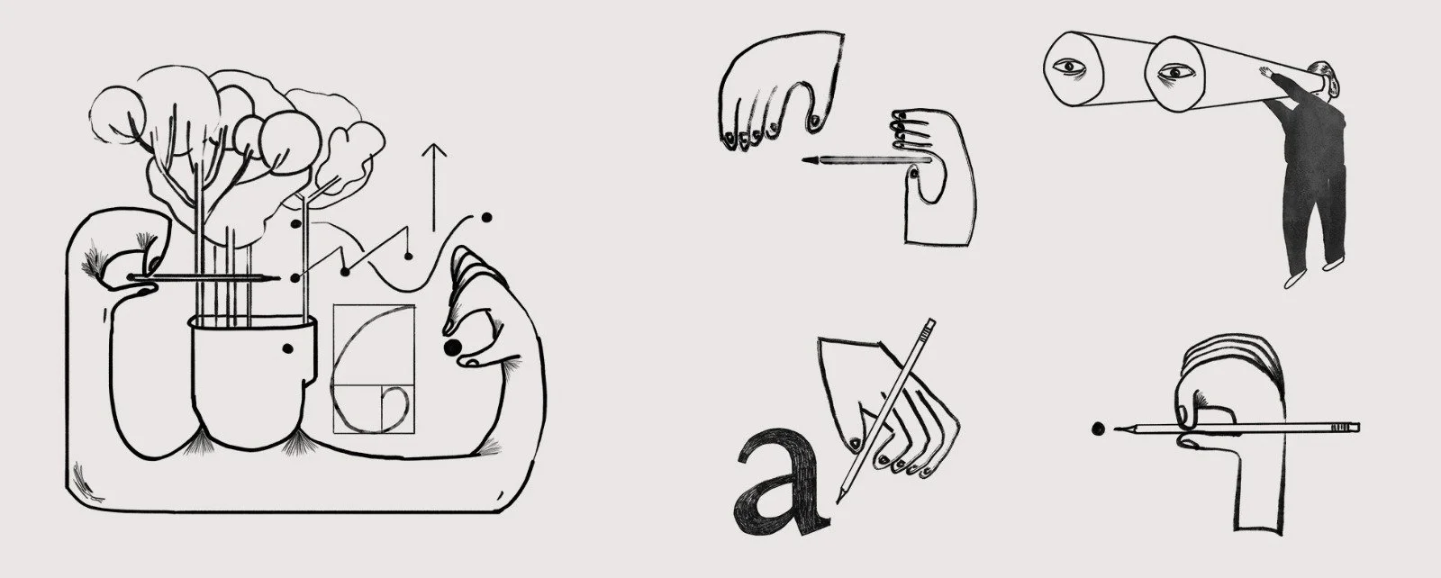
Maria Helena's first illustrations for the new Ofício website.
Visually, we wanted to maintain the connection between Craft and analogue, maintaining a solid presence of illustration with a more vibrant use of colour and, consequently, careful use of photography.
Maria Helena's designs, inspired by the first modernists, populate the new site and represent an expression we want to use in other supports.
These illustrations were already on the studio table before we started this work. It was, therefore, easy to think of their introduction as a "help" to the navigation on the site's first page, which adds a lot of information. Almost as a form of punctuating and smoothing the scroll-down path.
With the illustration, we also gave another layer of meaning to the company's identity, deepening and reflecting on what we are doing at every moment. The illustration also provides a certain immediacy and a clear brand identification, although we already have a very expressive logo. These illustrations are the starting point for a future flexible visual system.
With the introduction of illustration, we opened a whole new universe of possibilities: we can make specific designs for new parts and sections of the site, for the newsletter, stationery and presentations, diversifying the visual universe of Ofício while reinforcing the scope and coherence of its identity.
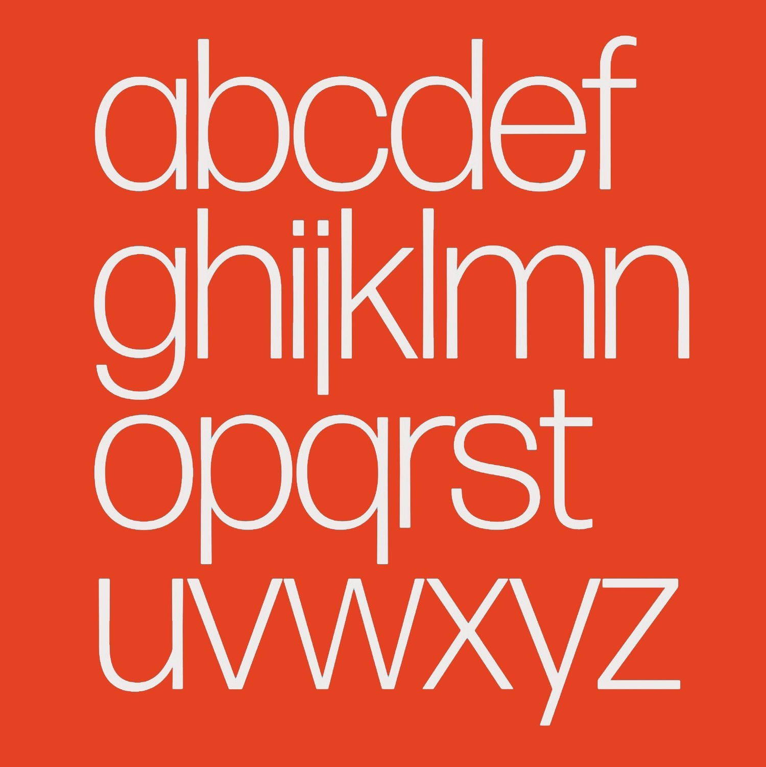
The typography, Forma DJR, was chosen by Miguel Moreira in the exercise that started when he developed the new Ofício's identity.
The "original" Forma was created in 1968 by Aldo Novarese as a response to the prevalent Helvetica, an Italian "sans", later recovered by David Jonathan Ross at the request of designer Roger Black.
"I'll admit it: when I first looked at Forma, I thought it was a bit boring. But through Roger's eyes, I began to see the typeface in a new light.
Gazing at his old type specimens, we looked beyond its obvious Helveticaishness and saw the culmination of an entire era of typography: an era when formal purity was the ultimate design achievement, when the spacing of headlines was outrageously tight, and when neutral neo-grotesque sans serifs were actually something fresh and exciting to read. Our digital interpretation, named Forma DJR, seeks to revive that excitement."
What attracted us to Forma DJR was the entire process of updating - knowledge, something at the genesis of Ofício and Saber Fazer - and adaptation to the diversity of new media and methods. Simplicity, on the one hand, dissonance caused by chance, near miss on the other. But, as in Craft, imperfection can result when you master your Craft.
"Forma DJR embodies the peculiar collision of midcentury modernist precision and the smudgy realities of metal, ink, and paper. This revival is not based on Forma's original drawings, nor does it try to truly capture its designers' original intent. Instead it brings new life to a bygone typographic era, and seeks to recapture everything that Roger has loved about Forma for so long.
Expert type hunter Indra Kupferschmid obtained a casting of the original Forma in lead, and fresh proofs for us to use as source material for our revival. We found that many of the most interesting details were not present in Forma's original drawings, but were instead byproducts of the printing process. Stems that were supposed to be straight swelled at either end. Corners that were supposed to be sharp were rounded. We believe that Forma comes alive in these unintentional details, and worked to incorporate subtle bits of unevenness into our digital interpretation."
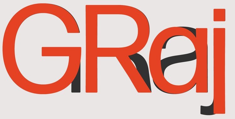
Although not foreseen in Miguel Moreira's initial work, we chose to use the "Swiss" alternative for the website. Developed for the DJR Forma by David Jonathan Ross, as Aldo Novarese had done for the "original" Forma, more visible in aa and gg but also present in rr and jj.
You can notice these differences here on the new site, where the titles/headings use the "Swiss" version, and the text uses the "Italian" version.
Now, we hope you enjoy this work as much as we do!
You can learn more about DJR Forma on David Jonathan Ross's website.
You can download the DJR Forma specimen here.

The superposition of the Swiss alternative over the Italian one.
The superposition of the Italian alternative over the Swiss one.
Credits:
Project Management: Mariana Teixeira
Art Direction: Maria Helena, Mariana Teixeira
Graphic Design: Mariana Teixeira
Illustration: Maria Helena
Home page photo: Miguel Barbot
Logo and typographic choice: Miguel Moreira
Typography: DJR Forma - David Jonathan Ross