
How we did The Seed’s identity
Text and images: Miguel Moreira
I am nostalgic when we remember Ricardo's first meeting with the Ofício team in the now-closed Manifesto, our second home in the Matosinhos Fish Market.
Ricardo briefed his first ideas for The Seed in its tranquil atmosphere. It's not just another lifestyle brand, a new venture operating in different areas, from business consulting to retail and product development.
It's a personal project that marks a new phase of our client's professional life. With The Seed, the founder pretends a more purposeful approach to business and to be more aligned with his interests and concerns.
In the weeks before starting the first drafts, Ricardo sent us his references, most of which were music-related. The '70s and early '80s rock bands were our starting point (do you remember when all the bands used to have a logo?), something very prevalent in the first drafts on paper.

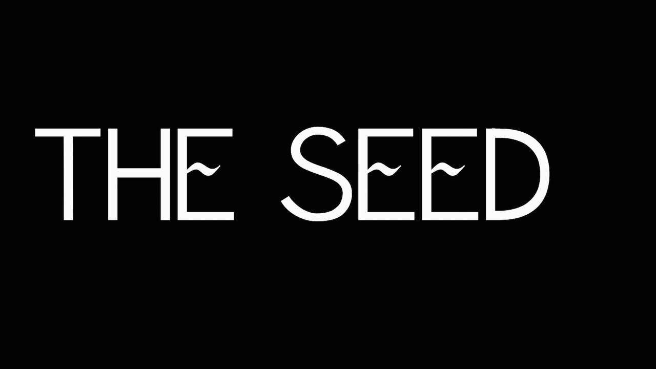
When reading "The Seed", a name that could easily be from a post-punk band, we automatically visualize the Seed itself. By doing a simple Google search, one can see that it is something prevalent in other logos. When trying to avoid this literal element in the logo, designers typically abolish the icon and create more neutral typography.
When searching for some singularity, I tried different materials, including brushes with china ink, coal and a parallel pen. These experiments were a way of getting rid of cliches and finding an original solution.


The chosen proposal had a drawing made with the parallel pen as a starting point. This material allows some neutrality to the type and, at the same time, adds a more organic element, which is represented in the "E".
By doing this, I could find the balance between a neutral type and the subtle element of the bud or sprig.
To emphasize this idea of growth, the letters, totally personalized for this project, have different weights, representing a distinct plant growth stage. This new plant grows to positively impact its environment, such as the ventures supported by Ricardo's expertise.


We introduced a nuance to this simple approach, allowing the two words to function autonomously, like the two sides of the project: one more corporate, the other more personal.
The Seed doesn't have a website yet, but you can follow this project growing on Linkedin.
