
How we did Prata’s identity
Text e images: Maria Helena
"It crackles like a vinyl LP". Miguel's words transported me immediately to Prata's universe, a brand sharing the name with its founder Patrícia Prata.
Before designing the brand's identity, I knew I had to transmit a ritual, gestures and movement, simultaneously free and articulated to the millimetre.
Prata's collection is like a second skin the dancer wears during practice and outside the class. The pieces are designed with attention to the minimum detail, made to last many happy years and long training hours in air-cutting movements and repetitions. With this in mind, I was looking for something very expressive.

Moodboard
In my research, Wassily Kandinsky's "Point and line to plane" informed most of the process: I love this book, a marvellous piece exploring graphic expression, painting and geometry theories with scientific precision, relating them with dance and music.
In my workflow, a not exclusively visual one, I gather and filter ideas, defining the mood that informs the creative direction process and the branding decisions. We designed the logo from here in a broader communication context. It is a central part of the brand but only a piece among the other elements forming this context.
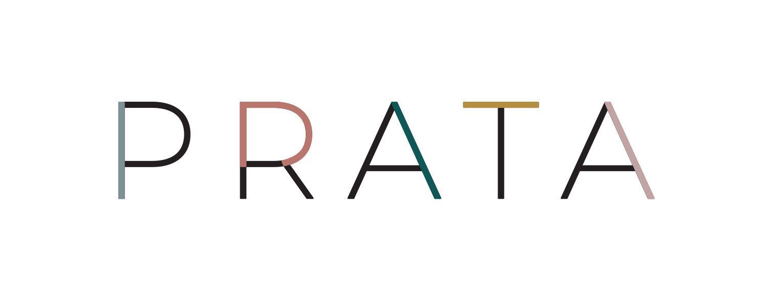
I tried to create unique visual signs transmitting movement, fluidity, and an idea of belonging and community. I used a minimalistic, geometrical and straightforward typeface. It contrasts with this idea of movement, gestures, and the unexpected, all represented by the signs' colourful lines and shapes.

The visual signs allow a very flexible, creative and symbolic communication by not depending on the word PRATA and its literal meaning (Prata is Silver in Portuguese). The word PRATA usually is present in all its shapes' emptiness, like a base layer. But it can simply not be there, creating a universal void, just like dancing is a universal art form.
Being PRATA, a fashion brand, I design all the graphics with textiles and their specifics in mind. The brand identity must work similarly in different media, from lookbooks to tags. The brand allows for various expressions, including motion, in a more digital environment.

We are still developing the brand, and the work is still in progress. The Ofício team follows and supports the brand path into a more significant venture and helps Patrícia in all the possibilities and gracious rotations still ahead.
This project started in 2019, and the Oficio team has provided PRATA with consulting in all the business creation components, from design to creative direction and sourcing to finances. We also assess the brand on the go-to-market strategy. The brand will be officially launched in the 2021 third quarter.