GRAMPA: a new identity for a historical department store in Porto’s Bolhão district

Text and photographs: Miguel Moreira e Miguel Barbot
Graphic design is the GRAMPA project's first and most visible part, which kept us busy during the second half of the year.
We started after Barbara's call asking Barbot's help in a crazy project of relaunching her grandparent's department store in downtown Porto. The new name, GRAMPA, refers to her heritage and the work of the previous generations, and a tool with the same name, a homage to handmade and small-scale production.

It was a concise consulting project consisting of only three sessions. The consulting aimed to provide mentorship and guidance in the strategy for the new shop's first few months. We went from the market analysis, including competition and inspiring cases benchmarking, to the store portfolio and the marketing plan draft. It was very intense, under a record schedule, right before well-deserved summer vacations.

After the consulting, Grampa commissioned Ofício to develop a new graphic design for the brand. Miguel Moreira designed the new logo and identity and did the artistic direction.
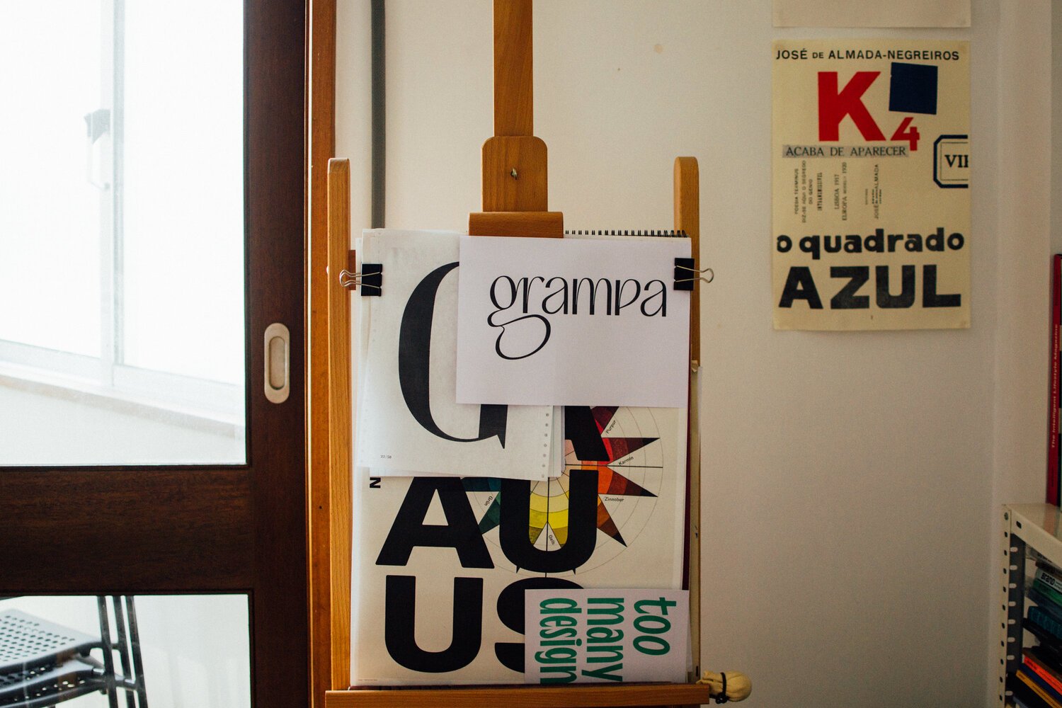
"Starting with the word Grampa, the first experiences were hand-drawn in my notebook while listening to Bárbara and Barbot talking about the motivations and expectations for this new venture. A few days later, we went through my drafts and the first selection of proposals, still hand-drawn.
I love every one of the letters in the word Grampa. They work together in a very harmonic manner, and I explored different designs with great detail. After choosing the idea that led to the final design, I used Glyphs to custom-design the typeface.


I wanted an organic 'G' with a big, unconventional loop that would harmonise all the other letters. So, after having the lines controlled, I printed A4 sheets and had them taped around the studio walls.
I like to let the designs rest and look at them later. I'm restless thinking about the many ways to improve a new design. This process is a way of having a fresh and more mature perspective on something that kept me busy for many days.

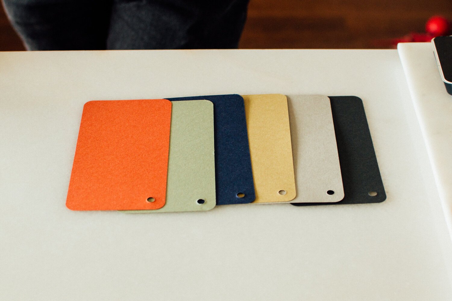
After having a logo, we started choosing the colour scheme, something done with the help of the G.F Smith paper catalogue. For the visit cards, we used the Textured Wild collection.
During the design process, I like to listen carefully to the client's expectations and consider Barbot's experience, visual culture, and in-depth project knowledge. This way, we can achieve a rich, high-quality result respecting the brand and its commercial purposes."